Summary: Just a quick post today to help familiarize you with some of the main navigation changes Google Analytics made to their interface this week. The labels aren't dramatically different, but some items have moved around and this is just sort of a crash course on what changed and where you'll now need to go to access certain features and menus.
Have you logged in to your Google Analytics account at all this week? If you have, you might have noticed some subtle, but significant changes. We're not talking about a complete
overhaul of the GA interface like last year, but the changes are significant enough that we thought you should be aware.
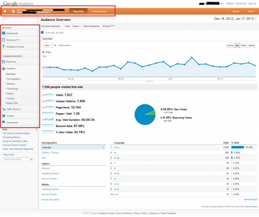
The most obvious changes were made to the main horizontal navigation (the orange bar at the top). Take a look at the sections in red boxes in the screenshot below and see if anything looks different to you (click to enlarge):

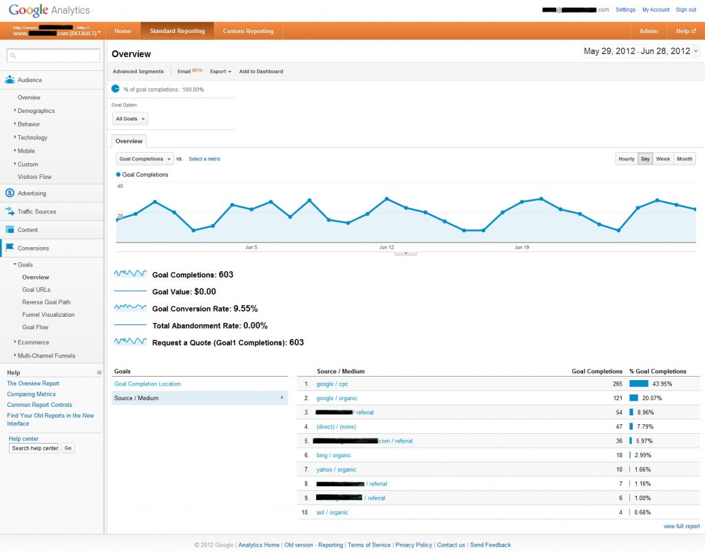
Need a hint? Check out this screen shot I used in a post last summer:

See the differences?
- "Home" image button added to the far left - This takes you to your account/profile list, which is useful mainly just for those of us that manage multiple client accounts, although the Analytics logo used to do the same thing.
- "Home" text button removed from just after the profile/URL name drop-down area - This section used to contain Real-Time, Dashboards, Shortcuts, and Intelligence Events, but they've all moved to the side navigation and are housed under two newly created sections. Real-Time is under the "Standard Reports" section, while the other 3 have migrated to "My Stuff".
- "Standard Reporting" and "Custom Reporting" are now more simply labeled "Reporting" and "Customization". Although IMO, "Customization" sounds more "Dashboards". "Custom Reporting" was actually a more descriptive and accurate label.
The "Advertising" section has now been put back within the "Traffic Sources" section, just below "Cost Analysis BETA".
There were also some significant improvements made to the Dashboards area, but given that I'm a little late to this game and Daniel Waisberg has already written about the changes, I'll send you over to
Marketing Land to read his post.
 Need a hint? Check out this screen shot I used in a post last summer:
 See the differences?
