In Google's latest attempt to keep users on a webpage they own and control, rather than clicking through to a business's website, they recently introduced in-line, "onebox"
restaurant menu results. I hesitated to blog about it at the time, in part because examples can be sparse, but after seeing another search results page tweak being rolled out, I thought I'd kill two birds with one stone.
Take a look at this screenshot that includes the Google menu results for
Tiny Thai in Winooski:
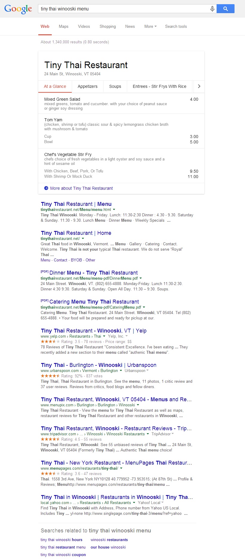
You'll see that you can flip through some of the restaurant's main categories and view a handful of menu items for each, but the menus are far from complete. If you really want to know your options, you're going to have to click through to the restaurant's site. Personally that's what I'd prefer to do, and even if at some point in the future Google seemed to have full menus, I still think I'd trust restaurants' official sites more and be compelled to click through.
Over at
Search Engine Land, Matt McGee posed a few important questions:
There’s actually more that we don’t know about the menus than we do. For example:
- Where is Google getting the menu details? It seems to be from sites like AllMenus.com and Gayot.com, but there’s no official list.
- Has Google made a deal with its sources to show the menus, or is it just scraping that information?
- What should a restaurant do if it wants its menu showing like this?
- What if it doesn’t want its menu showing this way for some reason? (It’s outdated, for example.)
- How often will Google be updating the menu information?
They later updated with this canned response from Google that doesn't exactly address any of the real concerns:
We get all of our menu data from a partner, similarly to how we show other types of answers, like weather. As our data comes from a 3rd party provider, we cannot add menus for individual restaurants directly, but we are constantly working to expand our database of menus and restaurants.
In any event, the goal is once again obvious - keep users busy on a "Google page" because that increases the chances they'll see and click ads. Ad clicks = revenue and happy shareholders. By displaying real menu items and pricing, though, Google can still honestly claim to be working toward delivering the most relevant search results. After all, they fewer clicks it takes a user to get to the information they're looking for, the better their experience, which is why they've been successfully rolling out things like the
knowledge graph and
carousel in recent years.
Aside from the menu onebox, did you notice anything else different about those search results? Take a look at the title tags/links of each result.... They're no longer underlined, and while it's hard to tell without a side-by-side comparison, the font weight is now heavier as well.
I can't help but wonder if the general public will even notice, but at first blush I'm not at fan of the underline being dropped. Unfortunately I'm pretty sure this is no longer in the testing phase because I've seen it tested when I've used incognito windows for weeks, but started seeing it while signed in today. I believe we're now seeing this released publicly.
Google Search Result Ad Styling
In the menu example above there obviously weren't any ads, but take a look at how those have changed as well, as of today, in the results for "plumber":
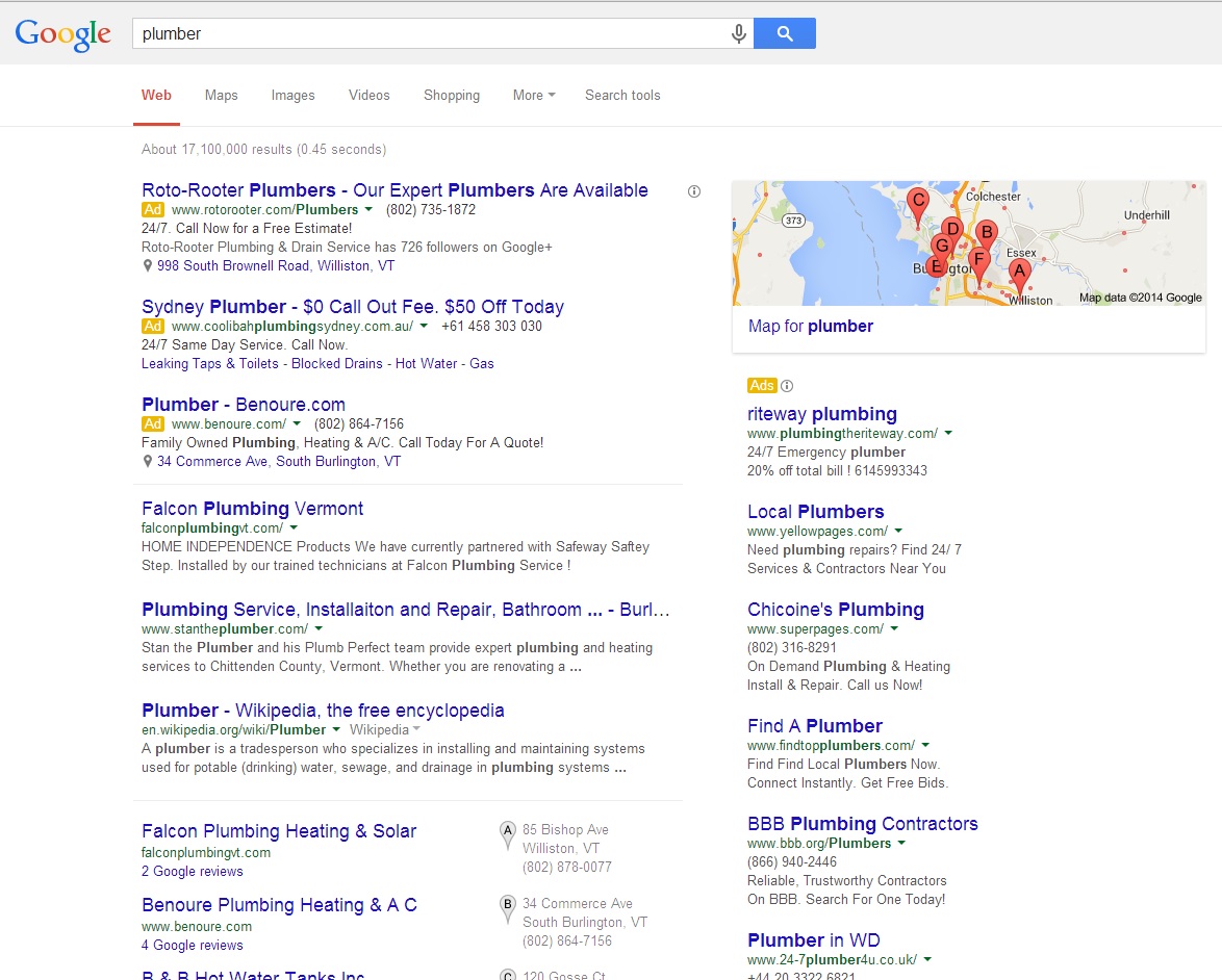
As you can see the sepia-toned background behind the top ads has been replaced by tiny yellow rectangles labeled "Ad" next to each of the top results and once above the sidebar ads. I actually
blogged about this when it was just a test back in November, but like the other changes we discussed, it seems to have been rolled out publicly today.
Savvy mobile web users will recognize immediately what Google is up to here - a more uniform experience across all devices. These characteristics have been present on mobile Google search results for some time now:
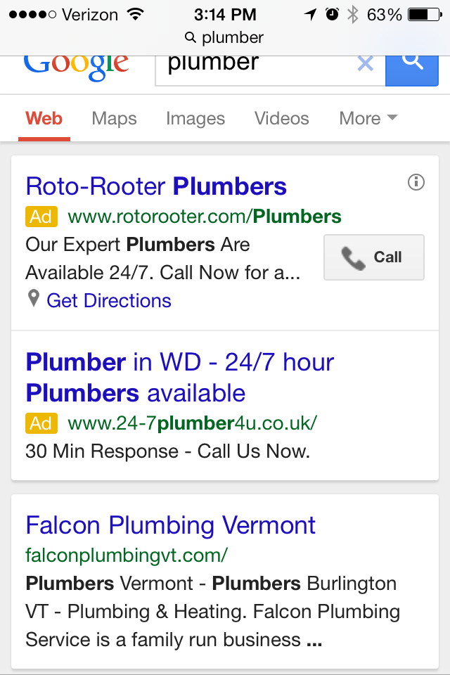
Side question: Did you happen to notice anything odd about the content of some of the ads, in both the desktop and mobile screenshots? In the desktop example, there are ads for Australian and British plumbers. The Brits also made the mobile screenshot. Back on desktop though, there's also an Ohio plumber ad, which isn't as bad, but still highlights poor
Google Adwords PPC management, given that we're seeing the ad in Vermont. Our friends at iMarket Solutions, who specialize in
PPC for plumbing and HVAC contractors, will be shaking their heads about this one.
So why would foreign plumbing companies' ads being showing in the US? Probably because they outsourced the work to a firm that's based here, and a PPC manager fell asleep at the wheel, forgetting to set up location targeting. This results in defaulting to targeting the entire country. If these ads were being managed by people in the plumbers' own countries, one would expect ads to default to targeting those countries.
If you represent one of those hapless plumbers and see the obvious need to make a change,
call iMarket Solutions today. If you need PPC advertising management and strategy for any other type of product or service, don't hesitate to
drop us a line.
 You'll see that you can flip through some of the restaurant's main categories and view a handful of menu items for each, but the menus are far from complete. If you really want to know your options, you're going to have to click through to the restaurant's site. Personally that's what I'd prefer to do, and even if at some point in the future Google seemed to have full menus, I still think I'd trust restaurants' official sites more and be compelled to click through.
Over at Search Engine Land, Matt McGee posed a few important questions:
 As you can see the sepia-toned background behind the top ads has been replaced by tiny yellow rectangles labeled "Ad" next to each of the top results and once above the sidebar ads. I actually blogged about this when it was just a test back in November, but like the other changes we discussed, it seems to have been rolled out publicly today.
Savvy mobile web users will recognize immediately what Google is up to here - a more uniform experience across all devices. These characteristics have been present on mobile Google search results for some time now:
 Side question: Did you happen to notice anything odd about the content of some of the ads, in both the desktop and mobile screenshots? In the desktop example, there are ads for Australian and British plumbers. The Brits also made the mobile screenshot. Back on desktop though, there's also an Ohio plumber ad, which isn't as bad, but still highlights poor Google Adwords PPC management, given that we're seeing the ad in Vermont. Our friends at iMarket Solutions, who specialize in PPC for plumbing and HVAC contractors, will be shaking their heads about this one.
So why would foreign plumbing companies' ads being showing in the US? Probably because they outsourced the work to a firm that's based here, and a PPC manager fell asleep at the wheel, forgetting to set up location targeting. This results in defaulting to targeting the entire country. If these ads were being managed by people in the plumbers' own countries, one would expect ads to default to targeting those countries.
If you represent one of those hapless plumbers and see the obvious need to make a change, call iMarket Solutions today. If you need PPC advertising management and strategy for any other type of product or service, don't hesitate to drop us a line.
