Summary: This week Google decided that instead of fixing any of the ongoing problems with Google+ Local or any of their other services, they would dangle a shiny new object in front of users and require that they update their personal and business pages with massive new images.... or run the risk of having their pages appear broken to users. Additionally Google+ Local added equally large non-interactive maps to the top of all listings, which in many cases only further complicates previously unresolved issues. Today we take a look at what changes were made, how they may have impacted you, and what you should do to deal with them.
As if Google doesn't change things on us often enough, this week they made unannounced changes to the entire layout of individual Google+ Personal Profiles, Google+ Business Pages and Google+ Local Pages.... Basically every page on Google Plus got an update. One of the layout changes is relatively subtle and not that big of a deal - "About" pages have been reorganized into a 2 column layout. Check it out on
our page and in the screenshot below:
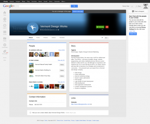
Not so bad, right? But did you notice anything else strange about the general *look* of the masthead (in the screenshot)? It might be a little difficult to spot if you've never been to our Google Plus page before, but it's obvious enough that I still think you'll probably notice something's off. If you're not seeing it, have a look at a more widely known brand's page and see if you see anything strange. Let's use
Toyota as an example:
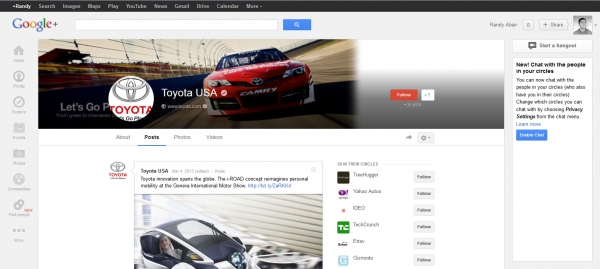
Did you see it that time? For starters, what's with all of that gray space to the right of the race car cover photo? Then, just to the left of the car a 250x250 px square profile picture used to hover but it's now been cropped into a circle. Looking back at the Vermont Design Works page screenshot you can see it worked out okay, but in the case of Toyota, the first "T" and the "A" are cut off, as is the "Let's Go Places" tagline, and even part of the top of the Toyota emblem. All of these where chopped off as if by a cookie cutter when the circle crop effect was added. And Google didn't stop breaking things there - this new circular profile image now overlaps Toyota's tagline and and sub-heading on the bottom left side of their cover image. This was also the case on our page, with our new "circle" profile image overlapping where our company name and tagline were on our cover photo. Fortunately our designer was able to slap together a photo for us to remedy this quickly - it would seem that Toyota isn't yet aware of the problem.
Upgrading Your Google Plus Cover Photo
So, we've highlighted the problem - time for a solution. Let's start with the dimensions of the new cover images. A friend at
iMarket Solutions who noticed that there's a similar new issue with maps on Google+ Local pages, which I'll address shortly, sent over a
link to this Marketing Land article which has this to say about the new cover photo dimensions (emphasis mine):
Profile pictures are now up to 2120px by 1192px using the 16×9 proportion. That pixelage wasn’t a typo; these pictures can be overwhelmingly huge, sometimes taking up all of your screen, not really sure why or if this is an enhancement.
"Up to" sounds like an option, but unless you want to have a horribly stretched and pixelated image, I would recommend choosing an image that meets those exact specifications. We first tried an image that was 2120 x 240, in hopes that it would tile/repeat vertically, but Google came back and saying the image had to be at least 480 x 270. See that we just narrowly missed the mark on the height requirement we bumped that up and tried 2120 x 270. Google accepted this image but stretched it all the way to the 1192 pixel height. Again, we're seeing that Google+ will allow images "up to 2120 x 1192, but it's abundantly clear that you must use those precise dimensions or Google is going to stretch your image to fit, ruining it in most cases... with 2 exceptions:
- If your background image is simply a solid color
- Your image is larger than 2120 x 1192
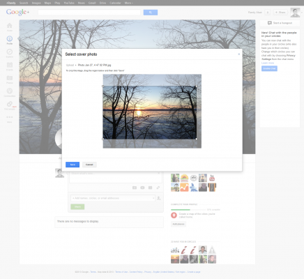
In the second scenario, images larger than the "up to" dimensions being reported, Google actually allows you to outline and select (crop, really) a section of your photo in the 16 x 9
aspect ratio. It's "go big or go home" time here because if you choose to crop a small section, you're still stuck with Google stretching it. But if you stretch the cropping tool to a large section, you should wind up with a nice high resolution Google+ cover photo - take a look at
my page, for example of what the final product looks like. And here's what the selection/cropping step looks like:
For personal pages, this seems to be the way to go - update your page with some great photo you took. Obviously this is can be a little more complicated for businesses. At VDW, we're lucky enough to have a designer in house, but we understand that most businesses don't, so if you need any help with a 2120 x 1192 image for your Google Plus page or any other graphic/web design services, feel free to
drop us a line.
How to Update Your Google+ Cover Photo
Whether you're using your personal Google+ profile or managing one of your brand/company pages, the process is essentially the same and in either case Google will most likely prompt you to update as soon as you access the page, with the "Cover photos just got bigger - Update yours now" call to action I snapped a screen shot of earlier:
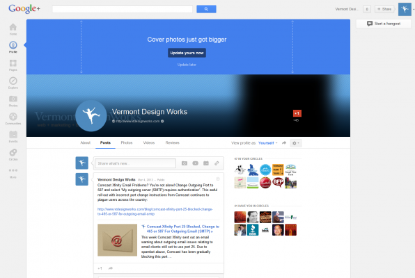
You'll obviously want to ignore this message or click "Update later" if you haven't thought about, selected and prepared a photo to use. You can always come back when you're ready and upload your new cover image. Again, you can check out the
placeholder we updated with for now, although it's worth noting that our designer would like to spend time getting creative with it - but this should get us over the hump. Here's what our business page looks like as I write this on 3/7 (before our designer has had a chance to fully customize):
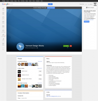
As you can see, the new 1192 pixel tall image
looks incredibly tall on the page and takes up a huge chunk of the first fold of the page. Because the new cover images are bumping so much of the "important information" (posts, about details, etc.) below the fold, Google has adjusted to their own odd change by auto scrolling you down part of the way. (In the screenshot above I've scrolled all the way up to show you just how huge the image actually looks). Again, take a look at
our live page and you'll see that you can scroll up. Setting aside the fact that this is Google attempting to adapt to an issue they created, it's just strange usability. Generally speaking, when a web page loads, the user sees the absolute top of the first fold and can only scroll down (not up).
Google+ Local Maps Super Sized Too
If you thought Google+ Local (Places) was immune to the impacts of this change, you'd be wrong.... That assumption would also mean you didn't read this whole post, because I mentioned this several times already! Anyway, the change to the Google+ Local pages is similar, but also quite different. First, take a look at how these pages now appear upon loading. Here's our Winooski neighbors
Sneaker's Bistro's page (who btw, recently hired us for
print design services to create their new logo and menus):
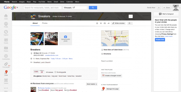
If you pull
up the page yourself you'll see that it sort of looks like not much has changed other than the circular cropping of the profile pic, right? But that's the result of Google once again auto-scrolling. If you scroll up, there is now a giant map (where the giant new cover photos live on all non-local Plus pages). The maps basically take up the entire first fold:
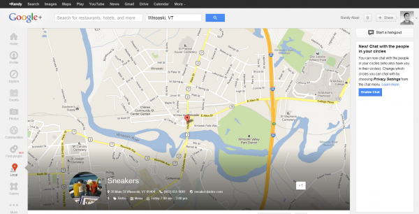
Again, the Google is auto-scrolling to prevent this type of first fold appearance... even though it was their own change that is causing it. One could argue that it's kind of convenient, however the map isn't interactive so it's not
that helpful... especially when you consider that there was and still is a thumbnail map in the sidebar (look back at first Sneaker's screenshot) that you can click and be taken to the
fully interactive Google Map. I guess you could argue that the new giant map right on the Google+ Local/Places page is a helpful snapshot of the business location, but then again when Google auto scrolling users past it, how many are even going to see it? Is Google trying to tell us that normal internet behavior should now involve scrolling UP after a page loads, rather than DOWN as has always been the case? C'mon.
If you don't deal with
local SEO at all, you might be forgiven if you don't find this weird large-map/auto-scroll behavior
that off-putting, but this can create genuine complications and confusion for some businesses. As you may or may not know, Google requires
"service area businesses" to hide their address in their listing. Basically if you're a plumber, house cleaner or any other type of service professional who's business doesn't actually take place at your own location, Google says you can't show your address in your listing... even though they continue to rank many listings that break this guideline very well, but that's another story. But if your address is hidden, what shows in the giant new map? Well, Google just shows a zoomed in section of roughly the center of the service area the business owner tells Google (in the back end) that they serve. This has been confusing in places/map results ever since Google started requiring service area businesses to hide their addresses, because in those map results you would see a pin that was centered in the service area and not the location. Obviously this leads to frustration for business owners (or web companies that manage these listings on their behalf) and confusing for potential customers. Adding this giant new map to Plus Local pages only compounds these issues.
I would say that the good news is Google will probably change this all again within a matter of weeks but unfortunately most of their updates are underwhelming at best and at worse, more problematic than the issue they claim to be resolving. This week's changes aren't the worst, but they certainly aren't moving things in a positive direction either. They'll probably have a neutral to slightly positive result for personal pages, while adding to ongoing frustration for business pages and local pages. The frustrating part is, we have to continue to adapt to whatever Google is doing because it's all about being found in the search engine they control. And in fairness, these are free services they offer to all of us, so it's hard to get
that upset... although it's easier to let the rage flow when you work for a
web firm, particularly one that
specializes in local SEO and Google is constantly changing the landscape for the worse. I'm quite certain after the last couple of years, most local SEOs feel about like this today:

 Not so bad, right? But did you notice anything else strange about the general *look* of the masthead (in the screenshot)? It might be a little difficult to spot if you've never been to our Google Plus page before, but it's obvious enough that I still think you'll probably notice something's off. If you're not seeing it, have a look at a more widely known brand's page and see if you see anything strange. Let's use Toyota as an example:
 Did you see it that time? For starters, what's with all of that gray space to the right of the race car cover photo? Then, just to the left of the car a 250x250 px square profile picture used to hover but it's now been cropped into a circle. Looking back at the Vermont Design Works page screenshot you can see it worked out okay, but in the case of Toyota, the first "T" and the "A" are cut off, as is the "Let's Go Places" tagline, and even part of the top of the Toyota emblem. All of these where chopped off as if by a cookie cutter when the circle crop effect was added. And Google didn't stop breaking things there - this new circular profile image now overlaps Toyota's tagline and and sub-heading on the bottom left side of their cover image. This was also the case on our page, with our new "circle" profile image overlapping where our company name and tagline were on our cover photo. Fortunately our designer was able to slap together a photo for us to remedy this quickly - it would seem that Toyota isn't yet aware of the problem.
Upgrading Your Google Plus Cover Photo
So, we've highlighted the problem - time for a solution. Let's start with the dimensions of the new cover images. A friend at iMarket Solutions who noticed that there's a similar new issue with maps on Google+ Local pages, which I'll address shortly, sent over a link to this Marketing Land article which has this to say about the new cover photo dimensions (emphasis mine):
 For personal pages, this seems to be the way to go - update your page with some great photo you took. Obviously this is can be a little more complicated for businesses. At VDW, we're lucky enough to have a designer in house, but we understand that most businesses don't, so if you need any help with a 2120 x 1192 image for your Google Plus page or any other graphic/web design services, feel free to drop us a line.
 You'll obviously want to ignore this message or click "Update later" if you haven't thought about, selected and prepared a photo to use. You can always come back when you're ready and upload your new cover image. Again, you can check out the placeholder we updated with for now, although it's worth noting that our designer would like to spend time getting creative with it - but this should get us over the hump. Here's what our business page looks like as I write this on 3/7 (before our designer has had a chance to fully customize):
 As you can see, the new 1192 pixel tall image looks incredibly tall on the page and takes up a huge chunk of the first fold of the page. Because the new cover images are bumping so much of the "important information" (posts, about details, etc.) below the fold, Google has adjusted to their own odd change by auto scrolling you down part of the way. (In the screenshot above I've scrolled all the way up to show you just how huge the image actually looks). Again, take a look at our live page and you'll see that you can scroll up. Setting aside the fact that this is Google attempting to adapt to an issue they created, it's just strange usability. Generally speaking, when a web page loads, the user sees the absolute top of the first fold and can only scroll down (not up).
 If you pull up the page yourself you'll see that it sort of looks like not much has changed other than the circular cropping of the profile pic, right? But that's the result of Google once again auto-scrolling. If you scroll up, there is now a giant map (where the giant new cover photos live on all non-local Plus pages). The maps basically take up the entire first fold:
 Again, the Google is auto-scrolling to prevent this type of first fold appearance... even though it was their own change that is causing it. One could argue that it's kind of convenient, however the map isn't interactive so it's not that helpful... especially when you consider that there was and still is a thumbnail map in the sidebar (look back at first Sneaker's screenshot) that you can click and be taken to the fully interactive Google Map. I guess you could argue that the new giant map right on the Google+ Local/Places page is a helpful snapshot of the business location, but then again when Google auto scrolling users past it, how many are even going to see it? Is Google trying to tell us that normal internet behavior should now involve scrolling UP after a page loads, rather than DOWN as has always been the case? C'mon.
If you don't deal with local SEO at all, you might be forgiven if you don't find this weird large-map/auto-scroll behavior that off-putting, but this can create genuine complications and confusion for some businesses. As you may or may not know, Google requires "service area businesses" to hide their address in their listing. Basically if you're a plumber, house cleaner or any other type of service professional who's business doesn't actually take place at your own location, Google says you can't show your address in your listing... even though they continue to rank many listings that break this guideline very well, but that's another story. But if your address is hidden, what shows in the giant new map? Well, Google just shows a zoomed in section of roughly the center of the service area the business owner tells Google (in the back end) that they serve. This has been confusing in places/map results ever since Google started requiring service area businesses to hide their addresses, because in those map results you would see a pin that was centered in the service area and not the location. Obviously this leads to frustration for business owners (or web companies that manage these listings on their behalf) and confusing for potential customers. Adding this giant new map to Plus Local pages only compounds these issues.
I would say that the good news is Google will probably change this all again within a matter of weeks but unfortunately most of their updates are underwhelming at best and at worse, more problematic than the issue they claim to be resolving. This week's changes aren't the worst, but they certainly aren't moving things in a positive direction either. They'll probably have a neutral to slightly positive result for personal pages, while adding to ongoing frustration for business pages and local pages. The frustrating part is, we have to continue to adapt to whatever Google is doing because it's all about being found in the search engine they control. And in fairness, these are free services they offer to all of us, so it's hard to get that upset... although it's easier to let the rage flow when you work for a web firm, particularly one that specializes in local SEO and Google is constantly changing the landscape for the worse. I'm quite certain after the last couple of years, most local SEOs feel about like this today:

