Summary: Since June there have been reports of users randomly seeing changes to the layout of Google search results pages. It wasn't until today that we saw the test version ourselves. The changes they're testing are somewhat subtle, but this could signal a full roll out soon, given that this has been ongoing for several months now.
Today is
Google's 14th birthday, and they decided to celebrate by testing new search results on me.
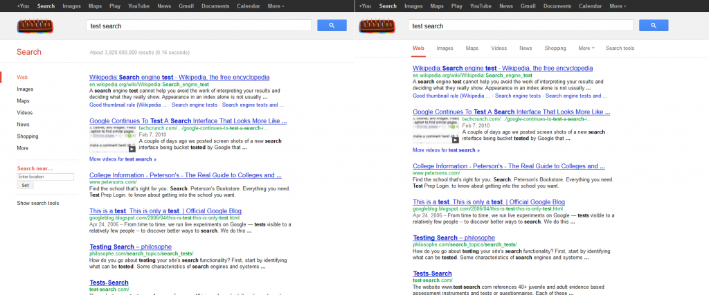
Quick, how many differences can you see in the two side-by-side images below (click to enlarge):

The "normal", familiar search results page is seen to the left and the version they are testing is to the right. Were you able to spot the changes?
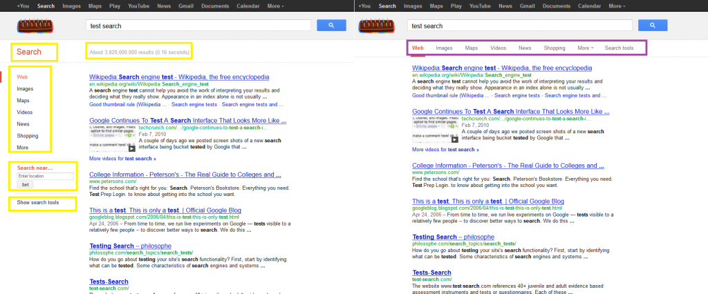
Take a look at the same image, but this time I've highlighted the differences:

The items inside the yellow boxes on the "normal" version aren't shown at all on the testing version, and one (the number of search results and time it took to load the page) section is replaced by a new navigation menu. Essentially the change seems to be a bout freeing up space to the left of the search results by moving the navigation to just above the search results, and dropping a couple of items. One of those items, though, is actually kind of important - location settings. If Google incorrectly autodetects your location from your IP address, as they often do here (they think we're in MA), you're not going to get relevant local search results. The "Show search tools" option is also dropped, but I don't think that's really a big deal. Some potentially useful tools there, but I doubt very many people use them.
Have you ever seen the test version? This was the first time I had so I grabbed the screenshot quickly. I know, from past tests, that they can be gone the second you close your browser and the only way you might ever see them again is if Google at some point decide to fully roll out a change. I'm reminded of the time less than 2 years ago that I would randomly see URLs showing up above meta descriptions in search results but no one else in the office did. Weeks later, Google rolled out the change for everyone - all of the time.
What's particularly interesting with this test is that it's been going on for months. As I said, I hadn't seen it before, but Barry Schwartz first
wrote about it back in June. Last week Schwartz
confirmed that others were still seeing the test, but follow that first link to his June post where he includes a mock-up of what he theorized Google may be up to. He's war gaming the idea that Google may be moving ads from the right to the would-be newly created white space in the left column. Not a bad theory, but it looks very cluttered to me which could turn off even faithful users. I know Google is in business to make money, and the
Adsense heat map shows higher click-through rates for ads in left columns, I'm not sure they're willing to risk a mass exodus of users with a change like this, which would potentially cancel out the increased revenue they might have expected.
Other than my point about the location settings disappearing I'd say my only complaint is that it seems odd to have 2 sets of horizontal navigation. See the black bar at the top? Some of the items overlap (images, maps, news) which is obviously a complete waste of space, and personally I'm actually drawn more to the black bar items. Seems to me that perhaps they're going to phase out the "new" white background part they're testing, but this would be a gradual move. Drop those items from the sidebar, but preserve them just above search results to ease people in to the idea, and then drop them totally. Not sure what they'll do with the space to the left. Maybe the search results themselves will just be slid over? Anyway, not a theory I've really worked on, but I'd lean more in that direction at this point.
What do you think? Any other theories as to what this change is all about? Let us know in the comments below...
 The "normal", familiar search results page is seen to the left and the version they are testing is to the right. Were you able to spot the changes?
Take a look at the same image, but this time I've highlighted the differences:
 The items inside the yellow boxes on the "normal" version aren't shown at all on the testing version, and one (the number of search results and time it took to load the page) section is replaced by a new navigation menu. Essentially the change seems to be a bout freeing up space to the left of the search results by moving the navigation to just above the search results, and dropping a couple of items. One of those items, though, is actually kind of important - location settings. If Google incorrectly autodetects your location from your IP address, as they often do here (they think we're in MA), you're not going to get relevant local search results. The "Show search tools" option is also dropped, but I don't think that's really a big deal. Some potentially useful tools there, but I doubt very many people use them.
Have you ever seen the test version? This was the first time I had so I grabbed the screenshot quickly. I know, from past tests, that they can be gone the second you close your browser and the only way you might ever see them again is if Google at some point decide to fully roll out a change. I'm reminded of the time less than 2 years ago that I would randomly see URLs showing up above meta descriptions in search results but no one else in the office did. Weeks later, Google rolled out the change for everyone - all of the time.
What's particularly interesting with this test is that it's been going on for months. As I said, I hadn't seen it before, but Barry Schwartz first wrote about it back in June. Last week Schwartz confirmed that others were still seeing the test, but follow that first link to his June post where he includes a mock-up of what he theorized Google may be up to. He's war gaming the idea that Google may be moving ads from the right to the would-be newly created white space in the left column. Not a bad theory, but it looks very cluttered to me which could turn off even faithful users. I know Google is in business to make money, and the Adsense heat map shows higher click-through rates for ads in left columns, I'm not sure they're willing to risk a mass exodus of users with a change like this, which would potentially cancel out the increased revenue they might have expected.
Other than my point about the location settings disappearing I'd say my only complaint is that it seems odd to have 2 sets of horizontal navigation. See the black bar at the top? Some of the items overlap (images, maps, news) which is obviously a complete waste of space, and personally I'm actually drawn more to the black bar items. Seems to me that perhaps they're going to phase out the "new" white background part they're testing, but this would be a gradual move. Drop those items from the sidebar, but preserve them just above search results to ease people in to the idea, and then drop them totally. Not sure what they'll do with the space to the left. Maybe the search results themselves will just be slid over? Anyway, not a theory I've really worked on, but I'd lean more in that direction at this point.
What do you think? Any other theories as to what this change is all about? Let us know in the comments below...
