At Vermont Design Works we know how important it is to keep up with changes to Google's search results pages so we're able to better understand how to adapt and optimize for the ever-changing web search landscape. Keeping a close eye on SERPs (search engine results pages) allows us to help our clients stay ahead of their competitors by anticipating the updates we might see in the coming days, weeks and months.
2012-13 Google SERP Changes
It was just over a year ago that I wrote
a post about Google testing the elimination of sidebar filtering, in favor of filtering that was all done via horizontal navigation at the top. No one else here in the office had seen the test at the time, but within months after I grabbed that screenshot, Google rolled out the change publicly for all users. And earlier this year while I was shopping for a jacket,
Google actually asked me for my search result preferences. Of course I'd be remiss if I didn't mention the ubiquity of the
Google Knowledge Graph over
the last year, along with
the carousel which just this summer began appearing for
local business searches. Just a few of the modifications to standard search results page we've seen over the last 12 months or so, but a worthwhile refresher, I think, before I touch on my latest observations.
Google Change Testing - October 2013
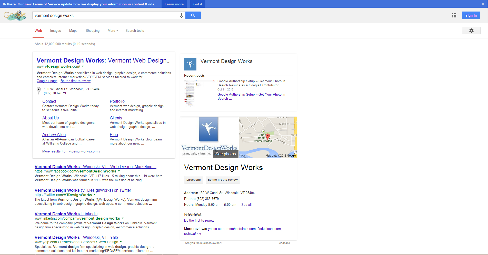
Earlier while reviewing the competitive ad situation for a branded search on the name of one of our long-time PPC clients I did a double-take when I saw an usually large font on the title tag of the company's website in the first position in organic results. Thinking it may have been a hiccup of some sort, I quickly searched for '
Vermont Design Works' and sure enough, the large font for the #1 organic result remained:
 Those with a keener eye might also notice the subtle, light gray box Google has drawn around the entire set of vtdesignworks.com results (home URL and sitelinks), but even a casual Googler couldn't help but recognize the considerable font size increase. Also, if you weren't already aware, Google often reorganizes title tags for branded searches by putting company names at the beginning. That's been happening for several months, but it's all the more obvious with the enlarged font.
As for the rationale behind making the official site more prominent ins SERPs, should it be fully implemented, it's anyone's guess. But for what it's worth, I suspect it has to do with the exact point I touched on above - competitors bidding on branded keywords, but Google wanting to throw those brands a bone. While it's a policy violation to use another company's trademark in ad text, bidding on trademarked keywords both
perfectly acceptable and
widely done.
Trademark terms used in keywords
Google will not investigate or restrict the use of trademark terms in keywords, even if a trademark complaint is received.
So perhaps Google is responding to complaints by placing a little more emphasis on the organic, branded listing to assuage the anger. Most of their efforts of late have seemed geared toward ad clicks or getting users to stay on Google properties (rather than clicking off to other sites), so this would be a bit of a departure - but why else might they test/make this change?
Additionally, Google has added some other features to branded SERPS, including showing business information (from Google Places/+ Local Listings) in the right column/knowledge graph area, as well as Google+ "recent posts", assuming the business has a Google+ business page. You can see examples of both of these sections in the screenshot above as well.
But once again, I was the only one in the office seeing this test. How about you?
In other Google testing news, Barry Schwartz over at Search Engine Land points out that Google Operating System caught Google testing, for the second time since 2011, the replacement of URLs with site names in search results. I've personally never seen this test, but again I'm curious if any readers have - please let me know in the comments below.
Barry also highlights a smaller Google SERPs "personalization" item over
at SE Roundtable today. Basically Google reminding users of their recent searches when they search for related phrases. I'm currently not seeing this either, so I'm withholding judgment on its usefulness for the time being.
Have you seen these tests or any others? Please let me know in the comments below and we'll update this post with anything noteworthy.
*UPDATE - 11/5/13 - Ad Appearance Changes
If you have a smartphone or a tablet, there's a good chance you've seen the following test while mobile browsing, but apparently
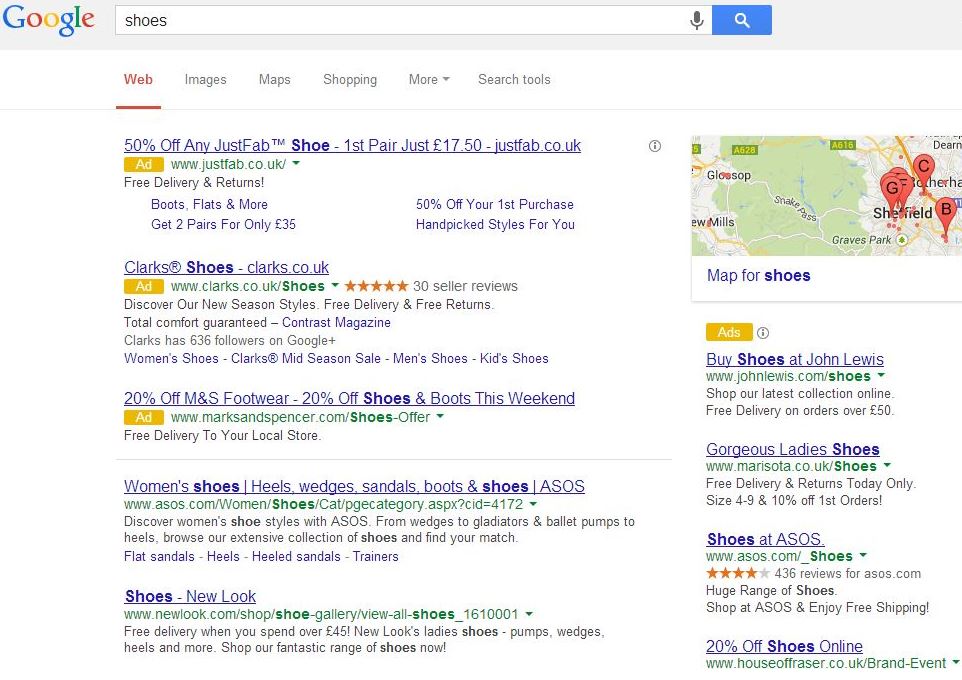
Google has begun testing a major change to the appearance of search ads on desktop as well - dropping the sepia-toned background (the currently differentiates ads from organic results), and instead just uses a small yellow "Ad" icon to identify ads.
 (Screenshot source: Ashley Williams of Summit Media, by way of Search Engine Land)
 Those with a keener eye might also notice the subtle, light gray box Google has drawn around the entire set of vtdesignworks.com results (home URL and sitelinks), but even a casual Googler couldn't help but recognize the considerable font size increase. Also, if you weren't already aware, Google often reorganizes title tags for branded searches by putting company names at the beginning. That's been happening for several months, but it's all the more obvious with the enlarged font.
As for the rationale behind making the official site more prominent ins SERPs, should it be fully implemented, it's anyone's guess. But for what it's worth, I suspect it has to do with the exact point I touched on above - competitors bidding on branded keywords, but Google wanting to throw those brands a bone. While it's a policy violation to use another company's trademark in ad text, bidding on trademarked keywords both perfectly acceptable and widely done.
 (Screenshot source: Ashley Williams of Summit Media, by way of Search Engine Land)
