
I
t's hard to believe but it's time once again for our SEO "year in review" where we turn the page on the calendar and take a look back on all of 2013's important developments in online marketing that had a significant impacts on the way we work. We started 2013 reviewing the accuracy of Rand Fishkin's (Moz) 2012 predictions and providing our take on his 2013 forecast. I didn't find Fishkin's 2013 predictions particularly bold because many largely boiled down to "expect current trends to continue", but he was mostly right, which I can't take away from him. After all, none of my predictions for new Google animals came to fruition either!
Now, lets discuss some of the more meaningful internet marketing changes we saw take place over the last year.
Adwords Enhanced Campaigns
In the first half of 2013,
Google Adwords began allowing advertisers the option to slowly, voluntarily migrate to the eventually mandatory "Enhanced Campaigns". The stated purpose of
Enhanced Adwords Campaigns are as follows:
- Powerful advertising tools for the multi-device world: Ability to manage your bids across devices, locations and time (e.g. bidding higher when showing your ad on mobile devices or to users who are within a half-mile of your store)
- Smarter ads optimized for varying user contexts: Ability to show the right creative, sitelink, app or extension based on the context of your prospective customers and the devices they’re using
- Advanced reports to measure new conversion types: Ability to track new conversion types, such as calls, digital downloads, and conversions across devices
Users who didn't opt to migrate by 7/22 then had their accounts automatically "upgraded" (Google's word). What was particularly interesting about this change was the fact that Google had always insisted that for best results, advertisers should have separate mobile/desktop accounts. This was a complete reversal.
Google Search Ad Format Changes & Tests
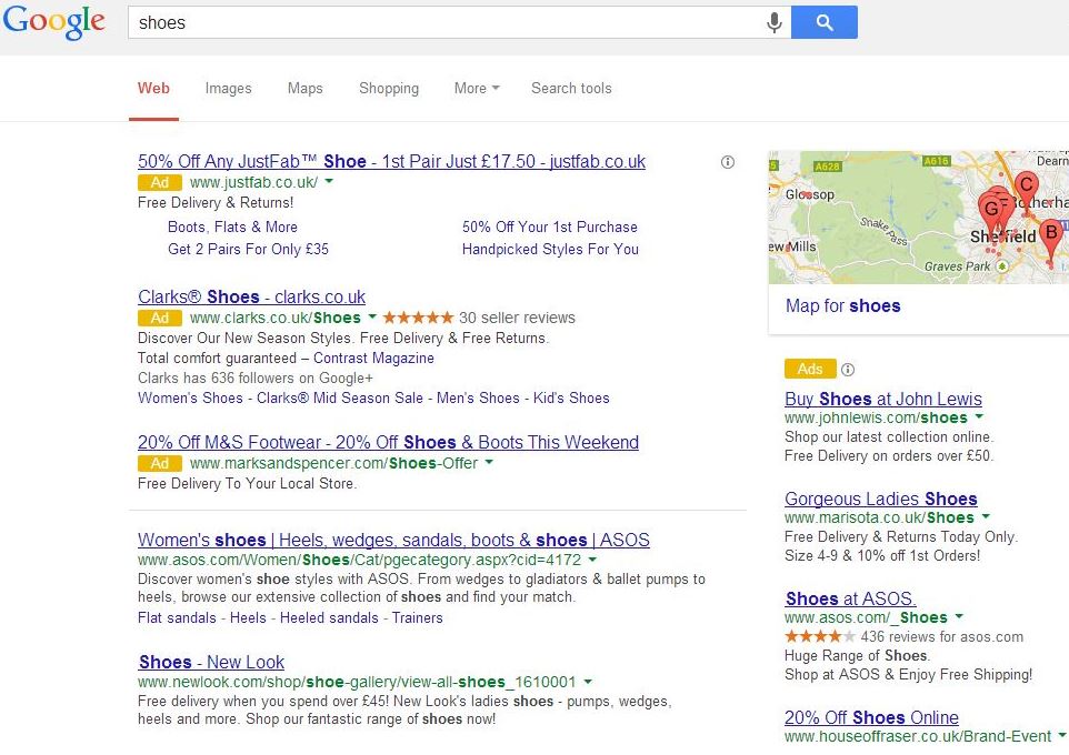
For what seems like most of the second half of 2013, Google has been showing search results ads with a completely new design on smartphones and tablets. Rather than the old pale yellow background, ads share the same white background as organic results, but have a small, yellow, rectangular "Ad" label next to each. More recently,
people have been seeing Google randomly testing this format in desktop results as well, myself included:
Facebook News Feed Change Threatened
Early in 2013 there was a lot of buzz about upcoming changes to Facebook. In March
it was revealed that big changes to the FB newsfeed were set to begin rolling out over the weeks following the announcement.... But here we are 9 months later and my mom is the only person I've seen receive the upgrade! Many of us here in the office even joined the official "
waiting list" on day 1, but have yet to get the actual upgrade invite.
Let us know in the comments below if you are one of the lucky (or unlucky) few to have the "new" news feed.
Google Analytics 2013 Changes
There were several impactful changes to Google Analytics over the past year, but the items below are among the more noteworthy.
(Not Provided) Keywords Takeover
Way back in June of 2012
I whined about Analytics taking away a lot of Google organic keyword data, and
attempted to show you some strategies to adapt. Essentially Google made searches from logged in users and Firefox users "secure", which resulted in the value "(not provided)" displaying, rather than the keyword used by the searcher. As frustrating as this was, it wasn't the end of the world because in 2012, the majority of keywords remained so we could still extrapolate trends.
In January of 2013 the (not provided) train began to accelerate when Google Chrome was added to the list of browsers that defaulted to "secure" search, but it wasn't until September that
Google moved to make ALL searches secure, hiding all organic keyword data behind "(not provided)". As it stands today, they've yet to hide 100%, but the trend is disconcerting to say the least.
Google Analytics Change History
In February 2013, "
Change History", a feature previously only available in Adwords, but coveted by Analytics users, was
rolled out to GA. It's not the most robust interface, but it gets the job done:
The Change History lists:
- Date column: The date and time of the activity
- Email column: Which Analytics user performed the activity
- Activity column: The Analytics object (e.g., account, user, view, goal, filter), and what activity was performed on the object (e.g., added to account, created, deleted)
Google Analytics Interface Change
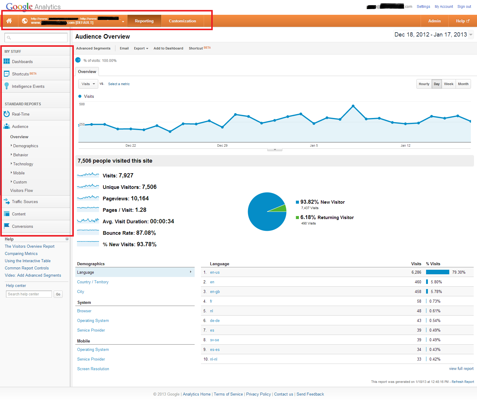
Google Analytics seems to reinvent its interface
about once a year, and 2013 was no exception. In fact
last January's overhaul was pretty significant, mainly due to the fact that the primary and secondary navigation were moved, and most of the labels were changed.
As significant as the menu changes were, it was the new custom reporting options that were really exciting for Analytics nerds. There's a bit of a learning curve, but I'm a big fan of just how granular you can get with real, actionable conversion and visitor data.
Pinterest Business Pages
Pinterest, like most social media sites, started out geared toward individual users before adapting to the marketing needs of businesses. Unlike some of the others, however, Pinterest recognized the need to accommodate businesses early on and
launched a personal to business account migration option back in March.
The process was actually very straightforward and simple, unlike say Facebook's profile-to-page migration, which causes you to lose all of your content, but at least converts friends to "likes". Pinterest's conversion to a business account allows you to keep all of your pins and boards. I can't tell you how many businesses and organizations we've run across who are understandably reluctant to make the change on Facebook because they'll lose years worth of work they put into their account.
Google Search Result Tests
In addition to the ad format changes and tests mentioned above, Google continues to randomly test various layout/design changes and making tweaks to organic results.
From font size tests and title tag manipulation to the pervasiveness and
polishing of the Knowledge Graph/Carousel. Additionally, Google added
carousel filtering options like price range and star rating for certain searches (restaurants, etc.), and reviews now pop-up in an overlay when clicked, rather than on the Google Places page.
Google Maps Changes
While it might seem that changes to Google Maps aren't particularly "internet marketing" related, they really are in the sense that they'll have an impact on your business or organization's online presence, particularly given the ever-shifting landscape of Google Places/+ Local and it's reliance on Maps. If your business appears on Google Maps (which it should), you'll want to make sure you know how the service works.
45-Degree Angle Aerial Photos
Satellite imagery has been available in Google Maps for several years, but it wasn't until Feb. 2013 that 45-degree aerial photos were introduced in select areas.
View Larger Map
Google Ski Trail Maps
If skiiers and riders are researching mountains they may check out on their next winter trip, you'll want to stay ahead of the curve and
stand out in Google Maps by having your trail maps available to users.
In addition to color-coded trail maps, Google has also begun adding
360 "street views" of some slopes and resorts. Only about a dozen have been added so far, but one would expect this number to grow.
Google Business Photos
In addition to the mountainside virtual tours, Google continued to push "indoor street views" in 2013, or as their officially known "
Business Photos". They now even have a large database of "
Trusted Photographers" who can take the 360 degree indoor shots - we even have 3 in VT! And even those that can't afford to hire a photographer can now
create their own virtual business tours using their Android phone or dSLR camera.
For those concerned about privacy or otherwise just not ready to take the virtual tour leap, you can still take customers "inside" your business using "
indoor maps", which also saw an expansion last year. As an example, take a look at the "map" of Best Buy in Williston:
View Larger Map
3D Google Earth Imagery
For several years now it has been possible for the uniquely bored to construct 3D virtual models of buildings and upload them to Google Maps, but examples were few and far between. For example, I recall only BTV airport having a "3D" version in Google Maps when I explored the area over the years. That all changed last fall when Google Earth and Google Maps (if you're a logged in user who's gotten the upgrade) began rending 3D satellite images.
Sadly it doesn't seem like they're letting you embed the 3D imagery yet so this screenshot is the best I can do for now:
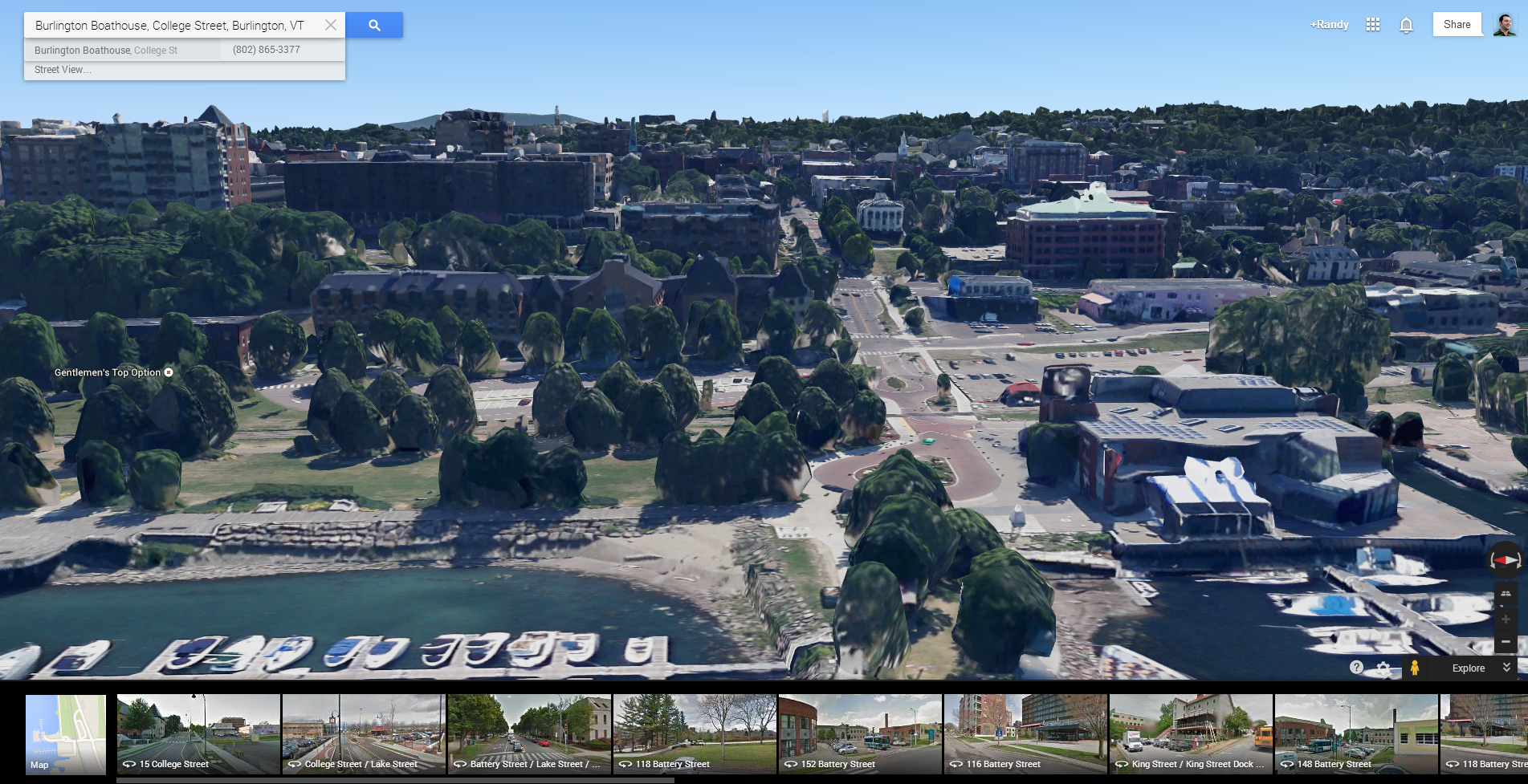
Like most maps features this is only currently available in limited areas, but the Burlington, VT area is lucky enough to be one of them. You can view anything in town from the north, east, south and west as well as from 2 different angles, if you're using "New" Google Maps. If you're using Google Earth you can essentially view from every possible angle or vantage point. I'd recommend trying out the latter to get the full experience, but either way, it's VERY cool and impressed all members of the tech-set that work here. Sure there's work to be done on the bubbly looking trees, etc., but this glimpse into the way things are headed is exciting.
Google Authorship
Google Authorship wasn't *new* in 2013, but it was probably the breakthrough year for creators of online content. Authorship mark-up was previously underutilized, but Google made a big push for bloggers and journalists to implement it throughout the year, including introducing less techy ways to get it all set up. (Previously a web developer was required).
The end result is millions of people's little faces showing up in search results next to content they created. Google says this is to help build authority, while us marketers enjoy the byproduct of increased click-through-rates that come with photo-assisted search results. Last month
Barry Schwartz reported on a reduction in authorship results - year, just as Google got us all to adopt the practice - but I haven't seen any dramatic drop-off. Long-story short, keep doing it until Google reverses its position on this in a couple of years (like you know they will).
Responsive Design
The phrase "
Responsive Design" was certainly coined before 2013, but like authorship it really took off last year. Nuances and disagreements about "responsive vs. adaptive" aside, to the layperson it boils down to building one website that responds/adapts to the individual user and their device, as opposed to having a "website" and then a "mobile website" (or even worse, having ONLY a "website" that just provides a terrible user experience on mobile devices). That's the gist of it, but you can read
our lengthy blog post on the topic here.
Again, this type of design and development existed prior to 2013, but it became far more important as the phrase entered the lexicon to the point where clients of web firms would demand it. Unfortunately, sometimes glomming on to the latest web design buzzword is, shall we say, not helpful. Depending on the type of product or service you offer, it might not be ideal to have a mobile site that serves up the same content on a mobile device. For example, if you run a local dry cleaning company and you have lots of great content pages on your site for SEO - that doesn't mean anyone is going to want to read it on their smartphone. Instead, smartphone users are just looking for a company to make contact with, so a basic mobile site with a "click to call" phone number is may be the way to go.
Obviously we've smack dab in the middle of the "mobile era" but it's always important to consider your audience before making big decisions like this. For what it's worth, here are the
3 configurations Google currently supports for smartphone-optimized sites:
- Sites that use responsive web design, i.e. sites that serve all devices on the same set of URLs, with each URL serving the same HTML to all devices and using just CSS to change how the page is rendered on the device. This is Google's recommended configuration.
- Sites that dynamically serve all devices on the same set of URLs, but each URL serves different HTML (and CSS) depending on whether the user agent is a desktop or a mobile device.
- Sites that have separate mobile and desktop URLs.
For more on the contentions debate,
check out this post and the comments that follow it. The author makes 3 great and simple arguments in favor of "responsive", but several commenters make equally strong counterpoints.
I'm sure I could go on and discuss several dozen other 2013 upheavals in the SEO and online marketing world, but I think we can all agree that, as always I've gone on long enough. If you think there's anything critically important (but not too inside baseball for the general population) feel free to let me know in the comments and I'll add it.
***UPDATE***
The post above was largely geared toward the arm-chair internet marketer - the "do it yourselfer" business owners who are using the web to market their business, but for a more inside baseball, micro look back, check out
this post from Google Webmaster Central:
 It's hard to believe but it's time once again for our SEO "year in review" where we turn the page on the calendar and take a look back on all of 2013's important developments in online marketing that had a significant impacts on the way we work. We started 2013 reviewing the accuracy of Rand Fishkin's (Moz) 2012 predictions and providing our take on his 2013 forecast. I didn't find Fishkin's 2013 predictions particularly bold because many largely boiled down to "expect current trends to continue", but he was mostly right, which I can't take away from him. After all, none of my predictions for new Google animals came to fruition either!
Now, lets discuss some of the more meaningful internet marketing changes we saw take place over the last year.

 Google Analytics seems to reinvent its interface about once a year, and 2013 was no exception. In fact last January's overhaul was pretty significant, mainly due to the fact that the primary and secondary navigation were moved, and most of the labels were changed.
As significant as the menu changes were, it was the new custom reporting options that were really exciting for Analytics nerds. There's a bit of a learning curve, but I'm a big fan of just how granular you can get with real, actionable conversion and visitor data.
 Like most maps features this is only currently available in limited areas, but the Burlington, VT area is lucky enough to be one of them. You can view anything in town from the north, east, south and west as well as from 2 different angles, if you're using "New" Google Maps. If you're using Google Earth you can essentially view from every possible angle or vantage point. I'd recommend trying out the latter to get the full experience, but either way, it's VERY cool and impressed all members of the tech-set that work here. Sure there's work to be done on the bubbly looking trees, etc., but this glimpse into the way things are headed is exciting.
